Your server can answer in ten milliseconds and your site can still feel slow. The reason is usually the same: the browser has the HTML, but it refuses to draw anything until it has downloaded and parsed every stylesheet the page declares. That wait is invisible in server metrics and painfully visible to visitors.
Why the browser waits
A browser could paint the page as soon as it has the HTML. It deliberately does not. If it did, you would see unstyled text for a moment, then a violent jump as the styles arrived. To spare you that, the browser treats stylesheets as render-blocking: nothing is drawn until they are all in.
On a typical WordPress site, that means 300 to 600 KB of CSS: the theme, the page builder, the form plugin, the slider, the cookie banner. The first screen a visitor sees uses perhaps 3% of it.
Critical CSS in one sentence
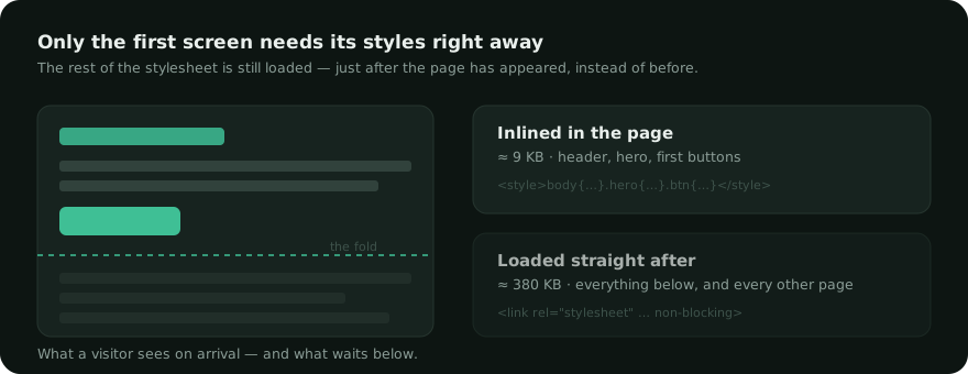
Take the rules needed to paint the first screen, write them directly into the HTML, and let the full stylesheets load afterwards without blocking anything.

The page appears immediately, correctly styled. Everything below the fold gets its styles a fraction of a second later, while the visitor is still reading the top. Nothing is removed from the site — the full CSS still arrives.
Why it is harder than it sounds
To know which rules paint the first screen, you have to know where the elements are. And to know where they are, you have to actually lay the page out — which means running a real browser at a real viewport size.
The same reasoning applies to images and to third-party scripts: what matters is not only the total weight, but what the browser needs before it can paint. Tools that skip that step work by matching selectors against the HTML. They can tell that a rule is used somewhere on the page, but not whether it is used at the top or two screens down. They remove dead weight, which helps, but they do not tell you what to paint first.
Doing it properly requires a headless browser, and most hosting plans do not have one — which is why this feature is usually offered as a service rather than as code running on your server.
What it is worth, honestly
Critical CSS mainly improves two things: the moment something first appears, and the moment the largest element of the first screen is drawn — the metric Google calls LCP. On a site whose server is already fast, it is often the difference between a mediocre score and a good one.
It changes very little for a site whose server takes 800 ms to answer. Fix that first — a page cache that answers before WordPress starts — because no amount of front-end work compensates for a slow response.
What to watch out for
- Different templates, different first screens. A measurement made on the home page is wrong for an article. One measurement per template is the sane unit — not one per page, which would never end, and not one for the whole site, which would be wrong everywhere but one.
- Mobile and desktop differ. Not the same width, not the same first screen, not the same rules.
- Anything measured can go stale. Change the theme, add a plugin, and the stylesheets change. The measurement has to be tied to them so it invalidates itself.
- Visitors without JavaScript must still get the full stylesheets. A
noscriptfallback costs nothing and avoids an unstyled page for a small minority.
Celeris measures critical CSS in a real browser on its own servers, once per template and per viewport. Nothing to install, and only the resulting rules come back to your site.